

Paint Colour Palettes Hyderabad for rooms that feel beautifully connected
Paint Colour Palettes Hyderabad by Limra Painters helps homeowners, apartment residents and workplace teams compare practical colour directions before painting begins. We bring walls, ceilings, flooring, furniture, wood finishes and natural light into one coordinated conversation, so the final palette feels intentional rather than selected from an isolated shade card.
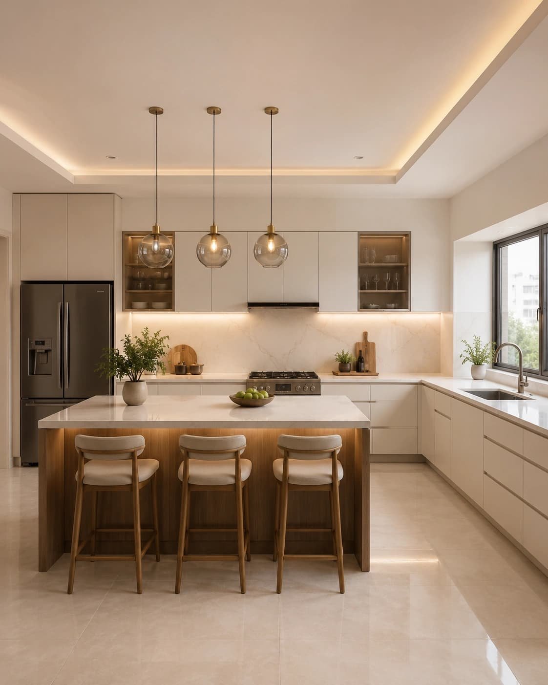
A palette is more than one attractive wall colour
A colour may look appealing in a photograph and still feel wrong when placed beside an existing floor, wardrobe, sofa, kitchen cabinet or strong curtain fabric. The purpose of colour planning is to consider the complete visual environment before a large quantity of paint is applied.
Limra Painters begins with the property and the desired feeling. A customer may want a brighter apartment, a warmer living room, a calmer bedroom, a more professional office or a contemporary exterior. Each goal leads to a different balance of light, depth, contrast and accent colour. The selected paint product, sheen and preparation also affect the visible result, which is why colour selection should remain connected with the actual painting scope.
The palettes on this page are design directions, not promises that a digital colour will reproduce exactly on the wall. Screens, cameras and image editing alter colour. A final choice should be checked using the current manufacturer shade reference and, for important areas, a practical sample or test patch.
Paint Colour Palettes Hyderabad for different rooms, moods and property styles
These nine directions show how a main colour, supporting neutral, deeper anchor and material tone can work together. They are intended to help customers identify a preferred family before moving to exact manufacturer shade codes.
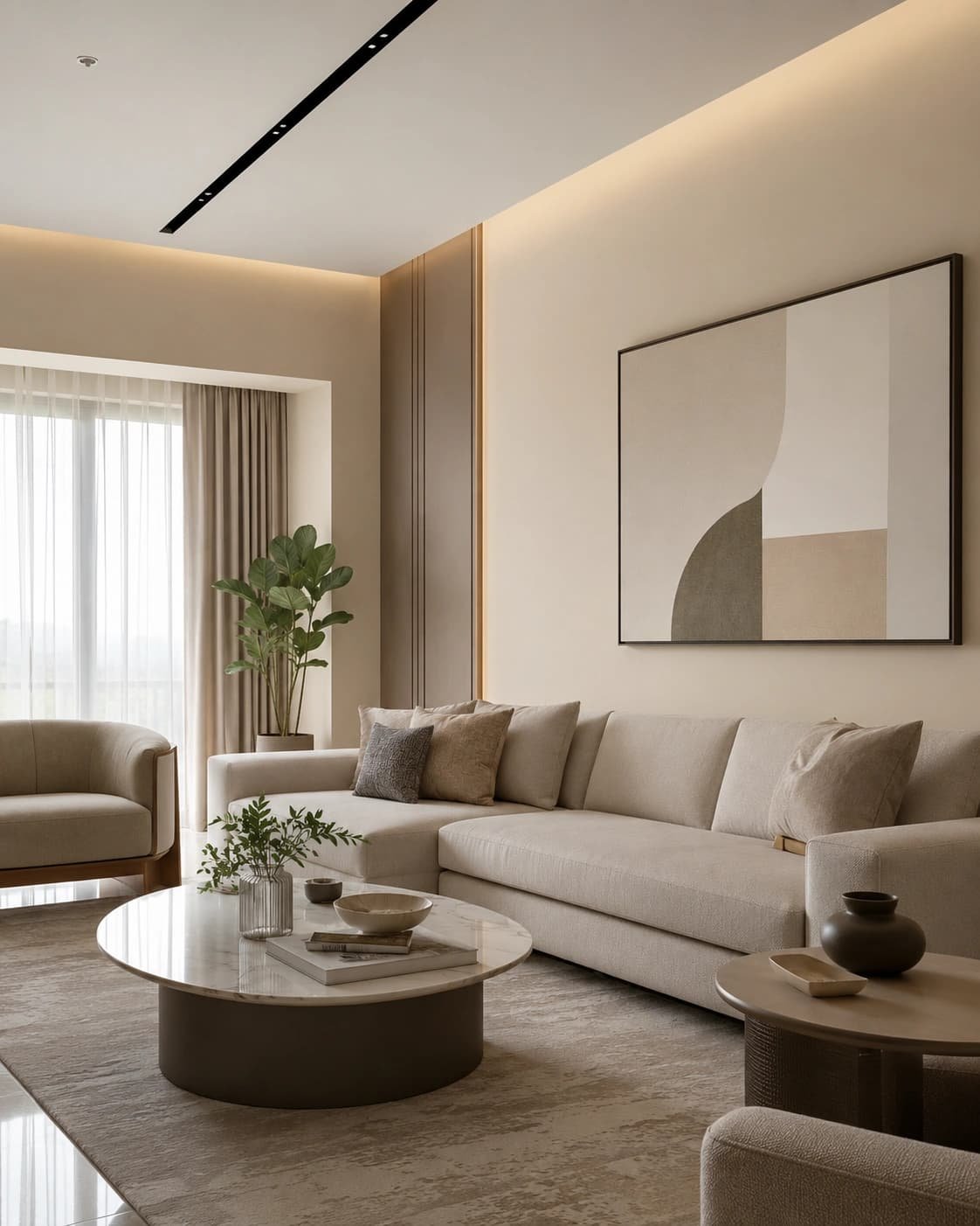
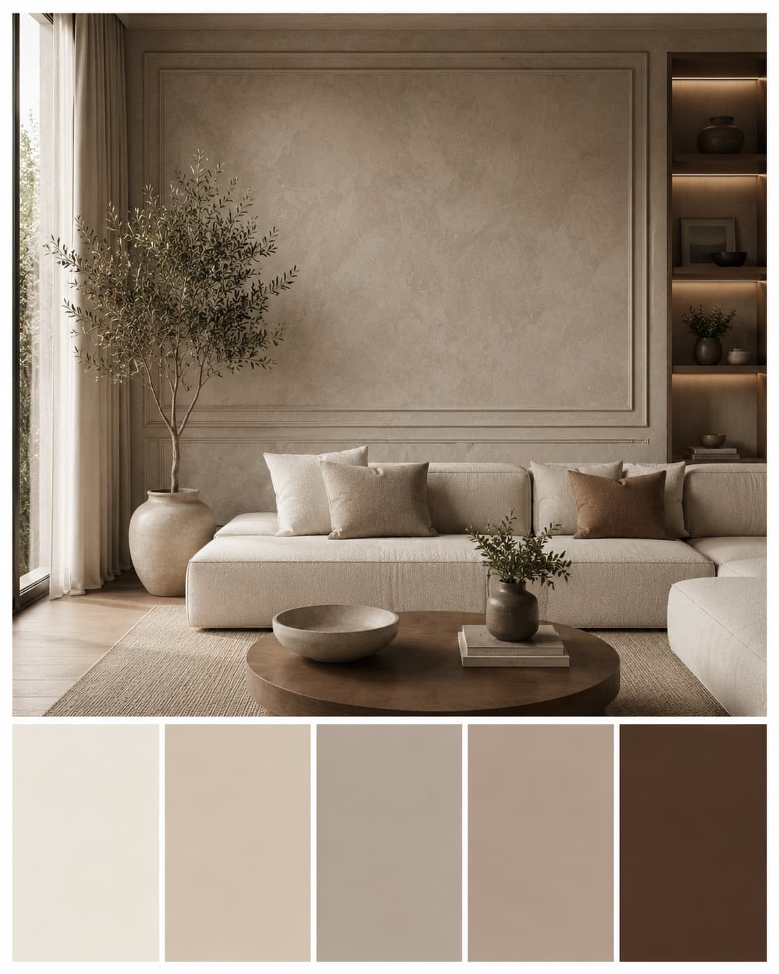
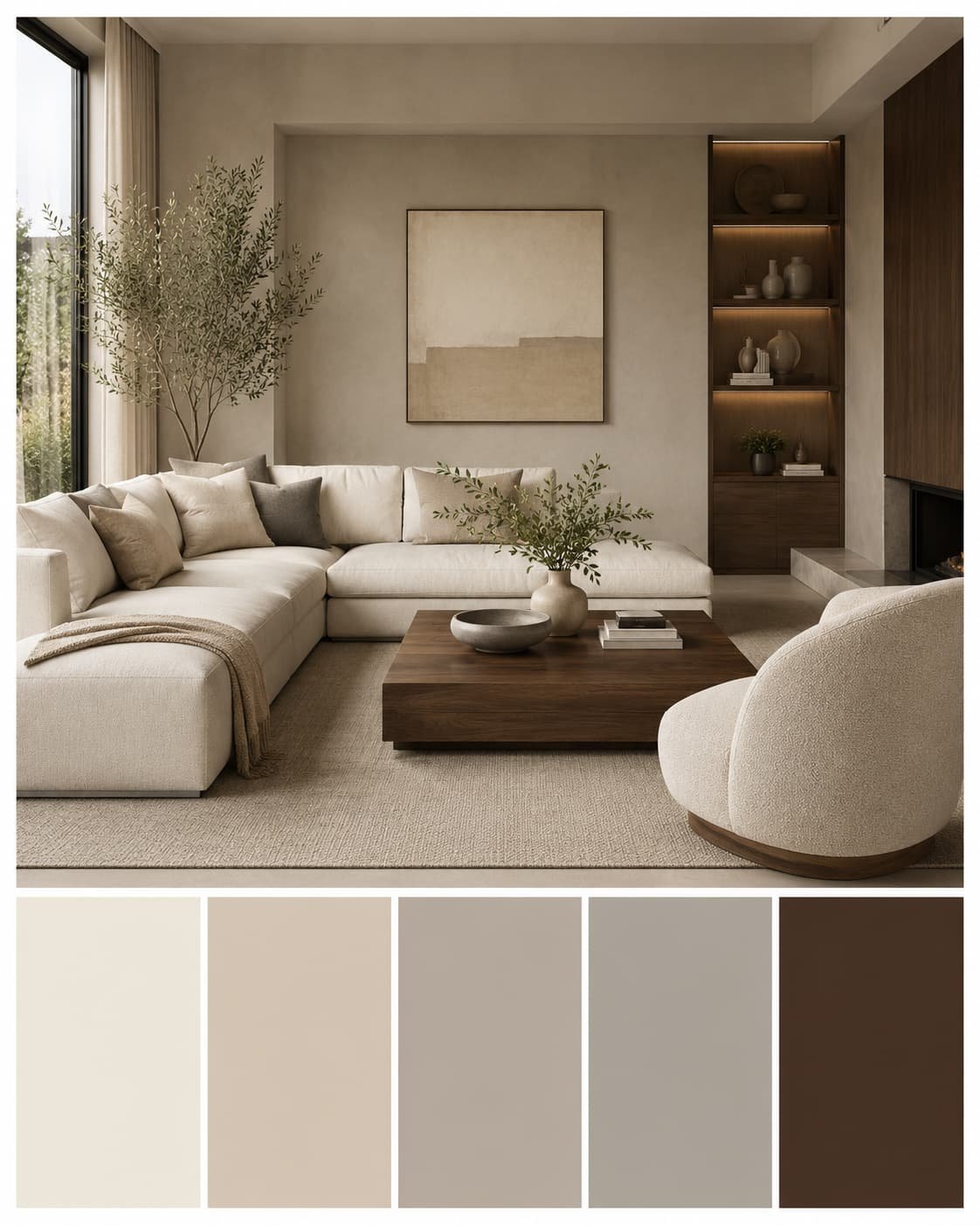
1. Warm Neutral Comfort
Cream, beige, taupe and walnut-inspired tones create a flexible base for living rooms with wooden furniture, warm lighting and soft fabrics.
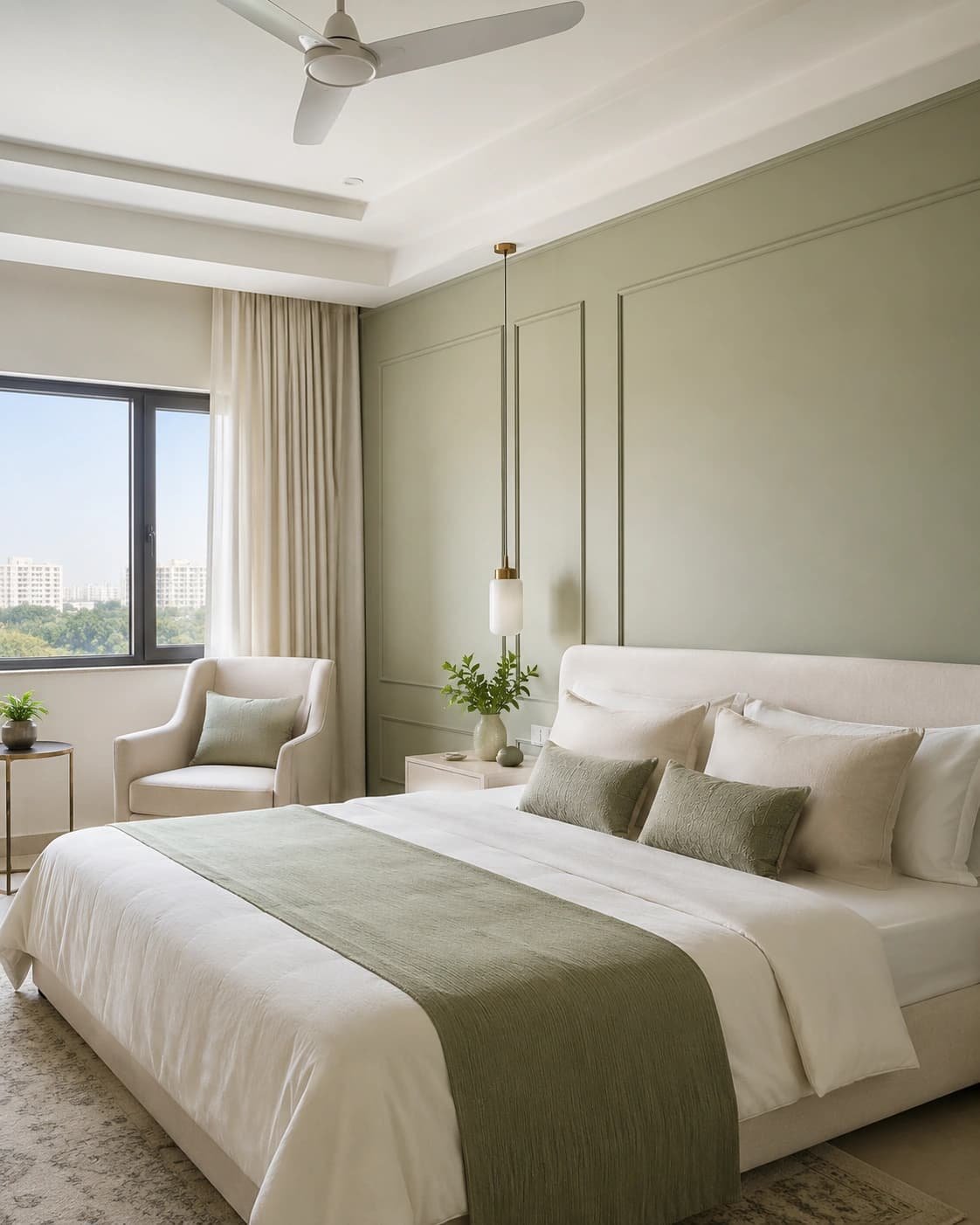
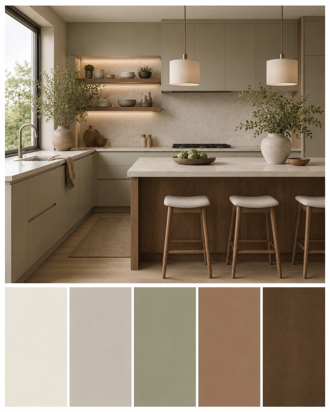
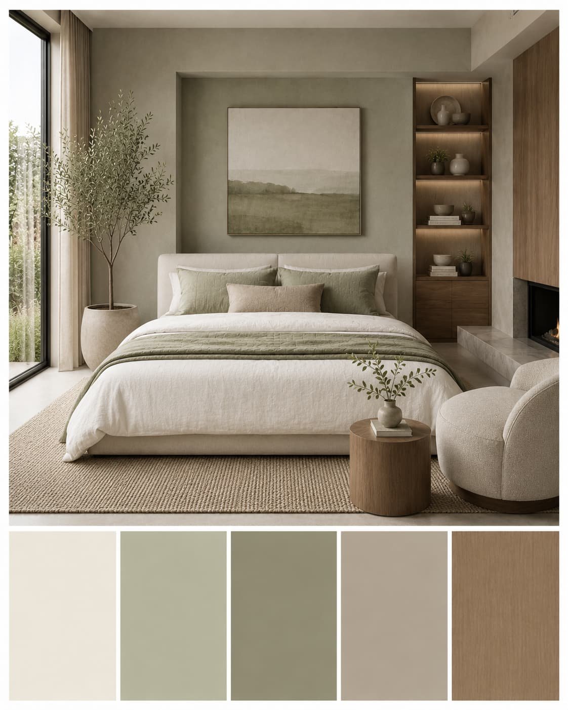
2. Soft Sage Retreat
Muted greens with warm off-white and gentle natural tones can support a restful bedroom without appearing cold or excessively decorative.
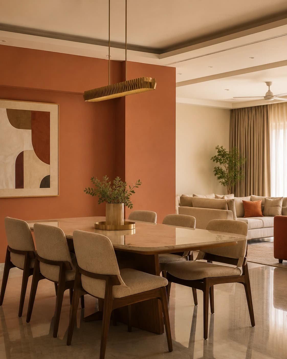
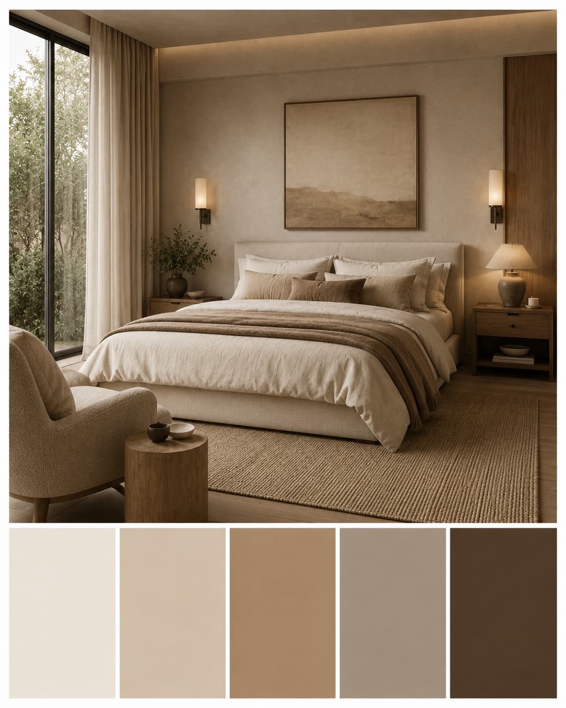
3. Earthy Terracotta Dining
Clay, sand, caramel and deep brown tones create warmth for dining rooms, entrance spaces and selected feature walls with natural materials.
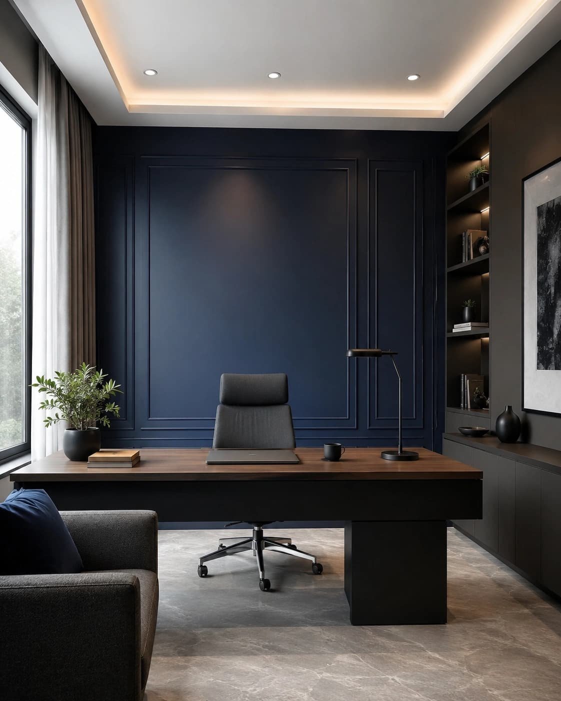
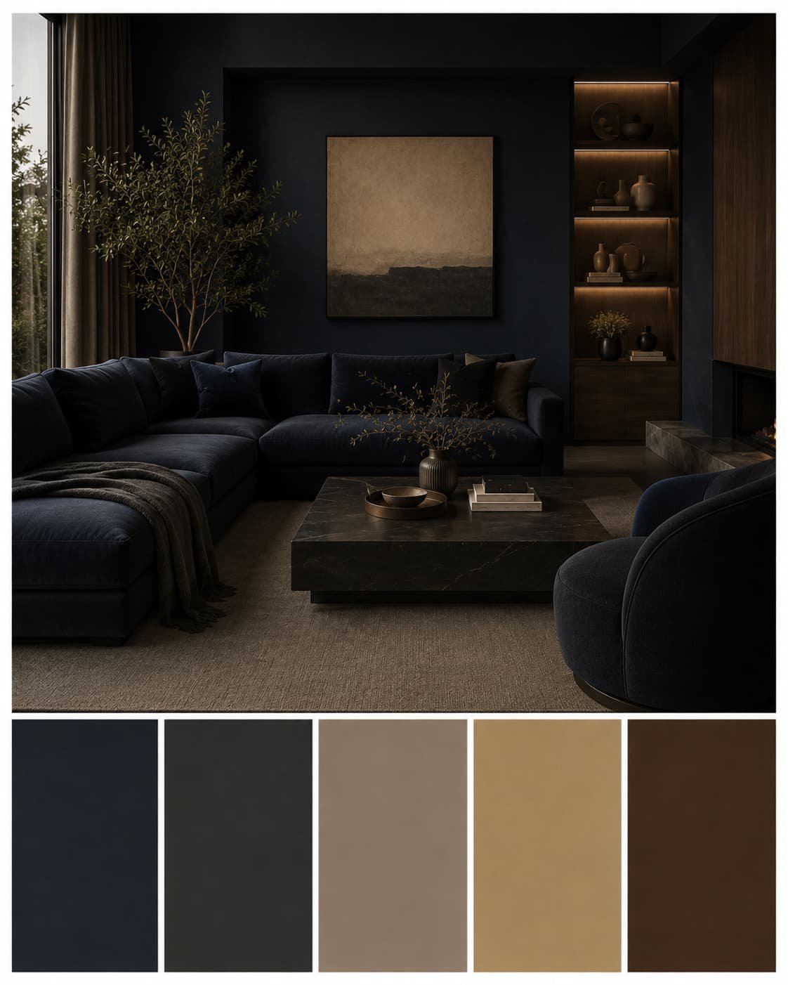
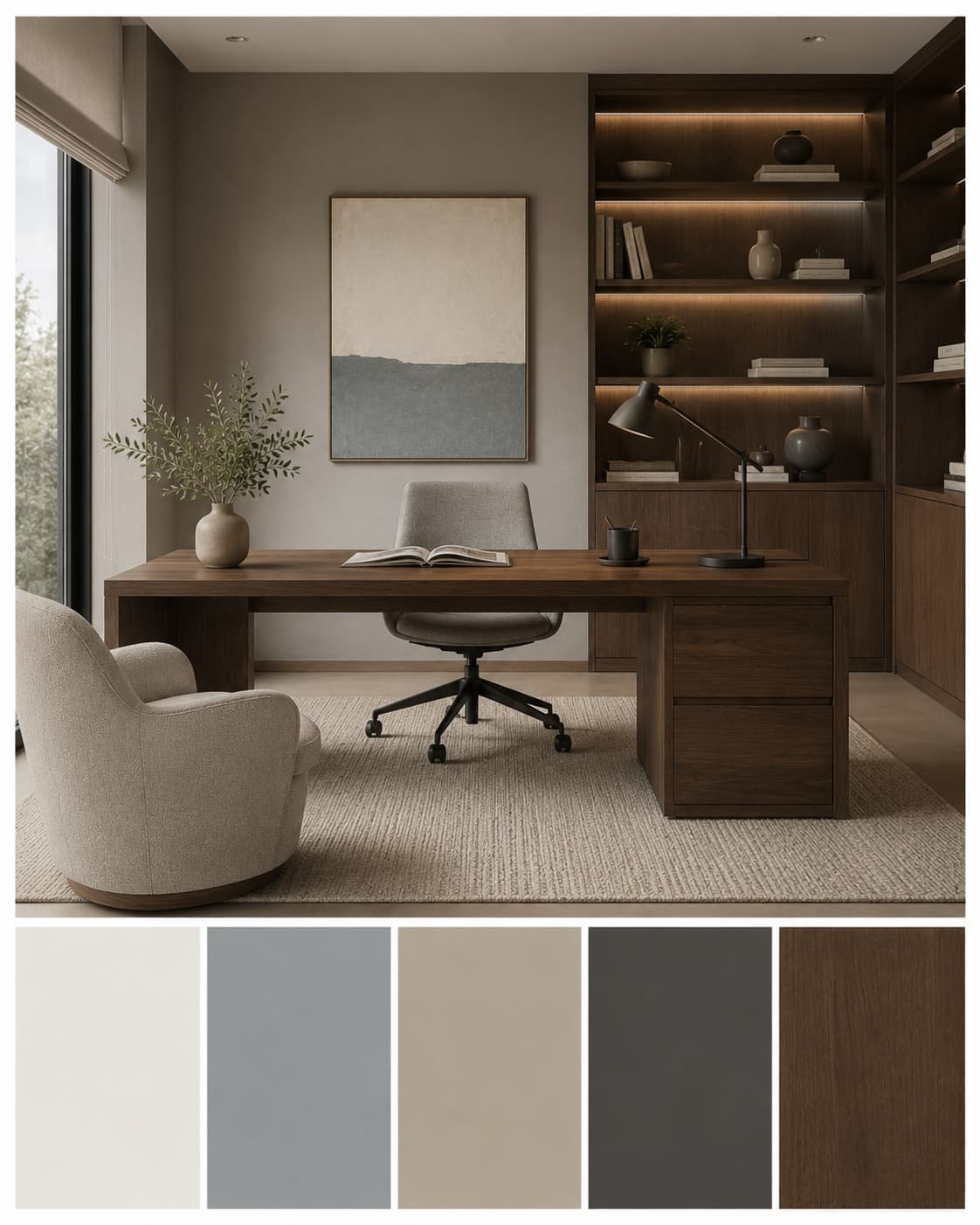
4. Focused Navy Office
Deep blue, balanced grey, soft white and warm wood can make offices and studies feel confident while retaining visual clarity for daily work.
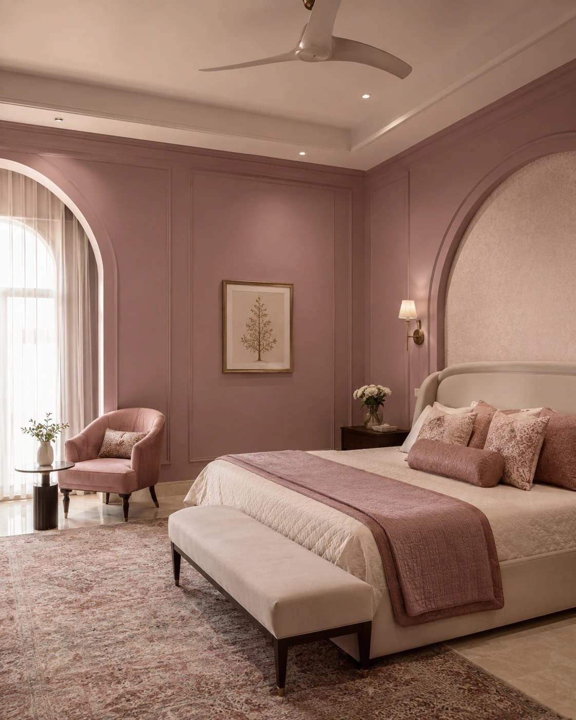
5. Blush & Mauve
Powder pink, muted mauve and warm off-white create a soft direction that can remain mature when balanced with simple furniture and restrained contrast.
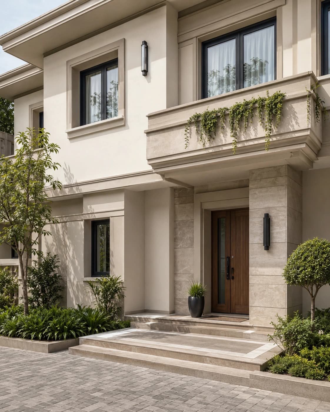
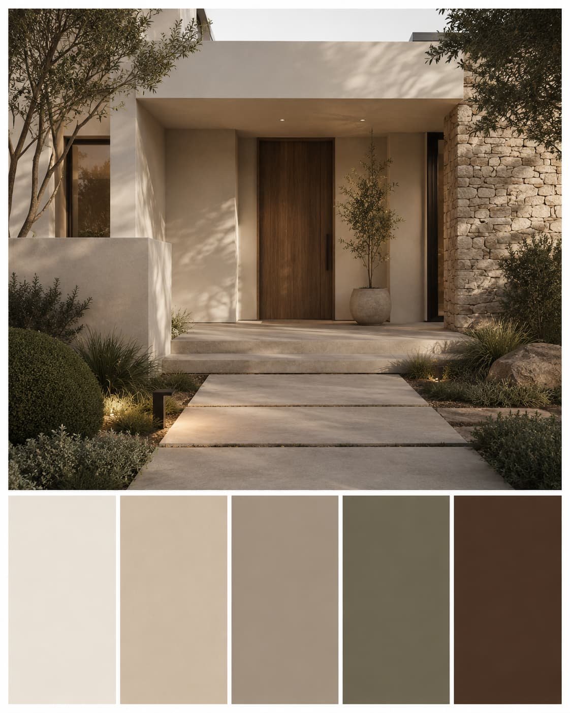
6. Modern Exterior Neutrals
Warm white, stone, greige and charcoal can organise a modern elevation when darker colours are placed carefully around frames and architectural details.
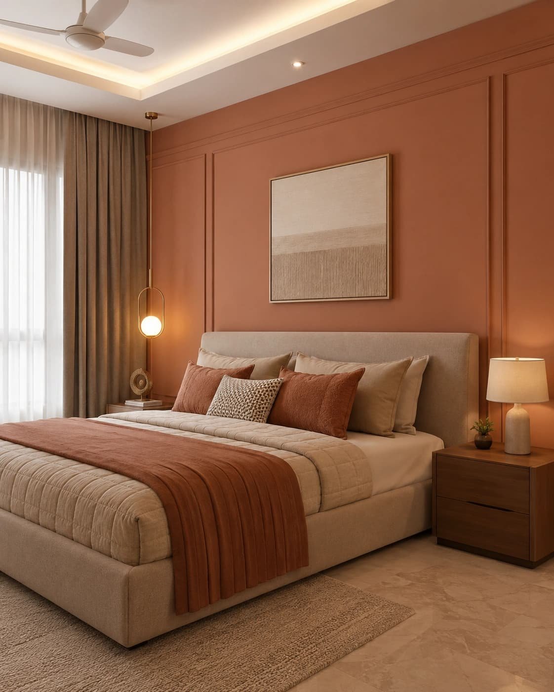
7. Terracotta Bedroom
Soft clay, warm cream and deeper rust accents can bring warmth to a bedroom while remaining balanced through lighter ceilings, fabrics and wood tones.
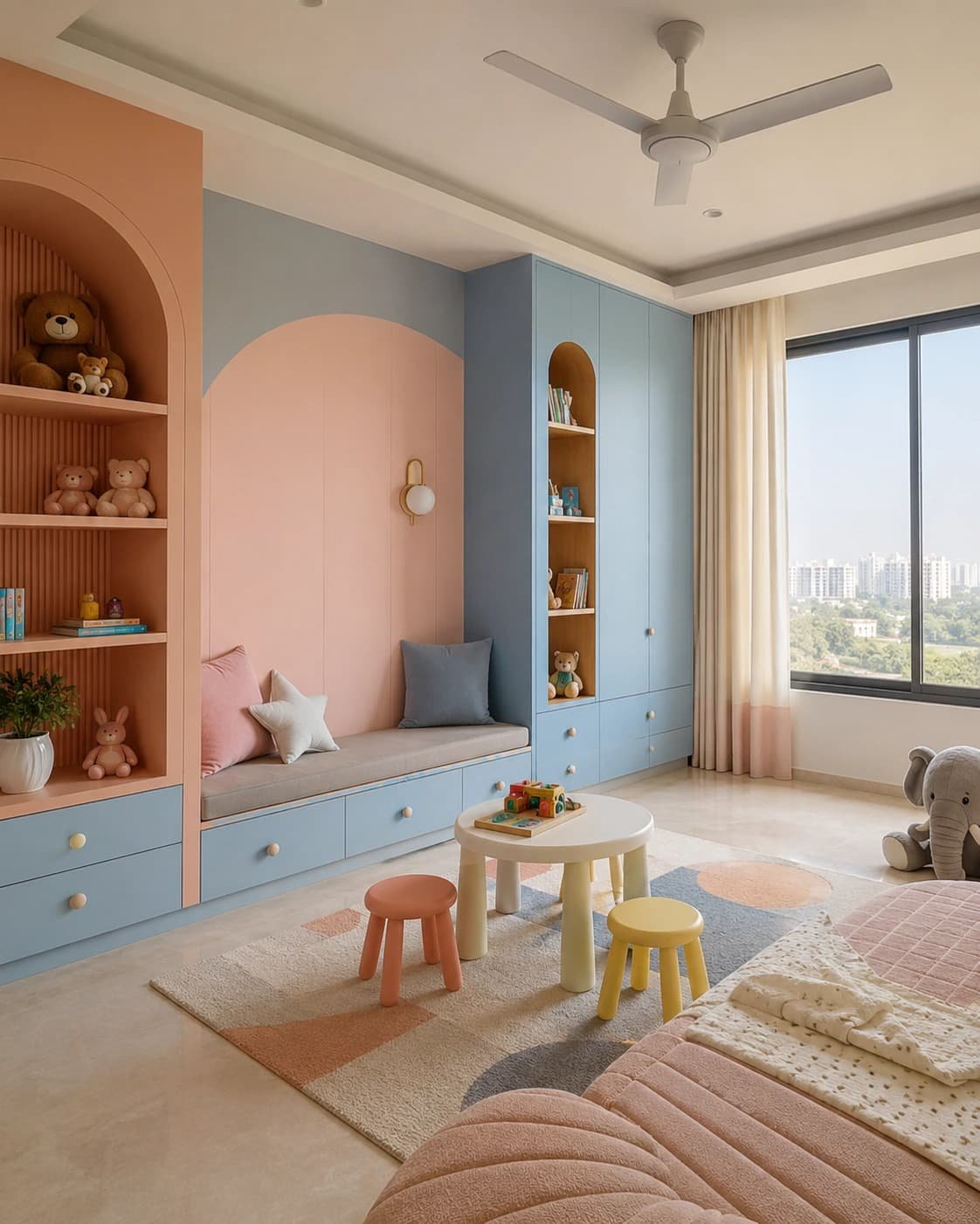
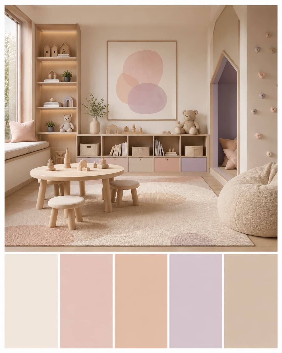
8. Gentle Pastel Mix
Soft blue, muted peach, pale yellow and warm white can create a cheerful children’s room without making every wall equally bright or visually busy.
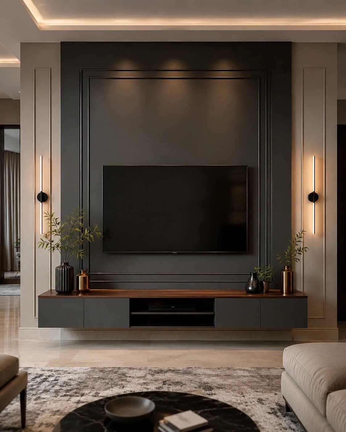
9. Charcoal TV Wall
Charcoal, warm grey, soft white and wood can frame a television wall with depth while the surrounding room remains brighter and easier to coordinate.
More colour combinations to help you discover your preferred style
Explore more coordinated colour combinations for homes and workspaces. Use these ideas to shortlist the tones you like, then compare them with your room’s lighting, flooring, furniture and existing finishes before making the final choice.
Choose colour according to how each space is used
The same palette can feel very different in a large living room, a compact bedroom, a narrow passage or an exterior elevation. Room function, daylight and fixed materials should guide the balance.
Living rooms
Start with the flooring, sofa and major wood tones because they occupy large visual areas. A flexible neutral base allows artwork, cushions and a selected feature wall to change later without repainting the complete room.
Bedrooms
Muted colours often support rest better than several strong contrasts. Consider the bed-back wall, wardrobe colour, curtains and warm evening lights together, rather than selecting a wall colour in isolation.
Dining areas
Warm neutrals, terracotta, olive and selected deeper tones can create a welcoming atmosphere. Confirm that the dining furniture and lighting do not make the combined palette too dark.
Kitchens
Cabinet shutters, backsplash, countertop and flooring usually control the palette. Wall colour should connect these fixed finishes and remain practical for the available light and maintenance expectation.
Offices and studies
A professional palette can use navy, blue-grey, greige or controlled green with soft neutrals. Strong colour should support focus and branding without reducing light or making video-call backgrounds distracting.
Exterior elevations
Exterior colours should be reviewed from a distance and alongside stone, windows, grills, gates and surrounding buildings. Product suitability, surface preparation and weather exposure matter as much as the palette.
Why a shade changes from one wall to another
Natural light has direction, intensity and colour. A wall facing strong daylight may reveal undertones that are barely visible in a darker passage. Warm artificial lights can make cream, beige and terracotta richer, while cool white lights may make the same colours appear flatter or more grey.
Flooring also reflects colour upward. Warm marble, beige tiles, grey vitrified floors, dark wood and colourful carpets can each alter the way a wall is perceived. Large wardrobes and kitchen cabinets behave like permanent colour blocks, so they should be part of the palette from the beginning.
Review daylight and evening light
Look at the proposed family in the morning, afternoon and after the room lights are switched on. A balanced choice should remain acceptable throughout the times the space is normally used.
Place samples beside fixed finishes
Compare a sample with flooring, wood, stone, curtains and major furniture. This reveals whether the undertone feels connected or creates an unwanted clash.
Check the complete wall scale
A tiny card can make a strong colour look manageable. On a large wall, depth and saturation become more noticeable, which is why test patches are useful for important decisions.
From inspiration to a confirmed paint direction
A simple process helps customers move from hundreds of colours to a manageable and property-specific shortlist.
Define the feeling
Decide whether the room should feel brighter, warmer, calmer, more spacious, more professional or more dramatic.
Record fixed colours
List flooring, wardrobes, cabinets, stone, wood, sofa, curtains and materials that will remain after painting.
Shortlist families
Reduce the choice to two or three suitable families instead of comparing unrelated colours from the complete catalogue.
Confirm exact shades
Review current manufacturer shade references and use a practical test patch where the wall area or colour strength justifies it.
Coordinate application
Connect the final colours with primer, paint category, sheen, preparation, wall sequence and the agreed painting scope.
Avoid choices that look attractive alone but fail inside the property
Most colour disappointments come from ignoring context rather than choosing a universally bad shade.
Selecting only from a phone image
Online inspiration is valuable, but screen settings can hide undertones and change brightness. Use the image to identify a direction, then confirm the real shade using an updated physical or manufacturer reference.
Ignoring flooring and wardrobes
Walls are not viewed alone after the room is complete. A cool grey beside warm beige flooring or a yellow cream beside a pink-toned wardrobe may create a clash that was not visible on the shade card.
Using too many unrelated accents
Several feature colours can make rooms feel disconnected. A stronger result usually comes from repeating one base neutral and controlling accents through selected rooms, walls, fabrics or decorative details.
Choosing the deepest colour for every wall
A dramatic colour may be successful on one carefully selected surface while becoming heavy across a complete room. Wall size, ceiling height, natural light and furniture coverage should influence the amount used.
Finalising before surface repair
Peeling, patches, cracks and uneven putty can distract from any colour. Where preparation is required, coordinate the palette with the correct wall repair, primer and final finish sequence.
Expecting one exterior colour to solve maintenance
Exterior appearance depends on product suitability, weather exposure, algae, cracks, preparation and drainage as well as colour. A practical palette does not replace the need for the correct exterior system.
Use current manufacturer catalogues when confirming exact shade codes
The following official resources can help with final shade identification. Catalogue appearance may still differ from the finished wall because of product, sheen, surface and lighting.
Asian Paints Colour Catalogue
Browse official colour families and current shade directions before confirming the product and code for the project.
Visit official catalogue →Nerolac Colour Catalogue
Compare additional official colour families and use the manufacturer reference for exact product-specific selection.
Visit official catalogue →Berger Colour Catalogue
Explore official colour ideas while remembering that the physical property and test sample remain important for approval.
Visit official catalogue →Colour-palette and painting enquiries across Hyderabad
Site visits and schedules are confirmed according to property type, location, scope and current availability.
Frequently asked questions about Paint Colour Palettes Hyderabad
Practical answers for customers shortlisting interior, exterior and complete-home colours.
Can Limra Painters help me choose colours before painting?
Yes. Share clear room or exterior photographs, flooring, furniture, curtain and wood-finish colours, along with the atmosphere you prefer. Limra Painters can help narrow the direction before the final paint shade is selected. The exact shade should still be checked through the chosen manufacturer catalogue and a physical sample where practical.
Will a colour look exactly the same as it appears on my phone?
No. Phone brightness, display settings, image processing and room lighting can change how a colour appears. Online palettes are useful for direction, but the selected shade should be reviewed in the actual property under daytime and evening light.
Which colours make a small room feel more open?
Light neutrals, soft warm whites, pale greige, muted sage and gentle blue-grey can help a room feel visually lighter. The result also depends on daylight, ceiling colour, flooring, furniture scale and how much contrast is used around doors and woodwork.
Can I use dark colours in a small bedroom?
Yes, when the placement is deliberate. A deep colour may work on a bed-back wall, television wall, niche or selected architectural area while the surrounding surfaces remain lighter. Dark colours should be checked against daylight and artificial lighting before finalising the room.
Should the ceiling always be pure white?
Not necessarily. A soft off-white related to the wall palette can feel more integrated than a very bright white. In low rooms, a lighter ceiling generally keeps the space open; in decorative ceilings, selected contrasts may be considered after reviewing the design and lighting.
How many colours should be used in one room?
Many successful rooms use one main wall colour, one supporting neutral and one accent through a wall, fabric, artwork or furniture. This is a practical starting point rather than a compulsory rule. Existing flooring, wood, stone and upholstery already contribute colours to the room.
Which exterior colours are easier to maintain?
Mid-tone neutrals, stone shades, greige, warm whites used with practical darker bands and selected earthy colours often hide ordinary dust better than extremely bright or very dark finishes. Exterior product selection and surface preparation are equally important for long-term appearance.
Can the same palette be used throughout the complete house?
A connected base palette can create continuity, while bedrooms, children’s rooms, kitchens and feature walls receive controlled variations. Repeating one or two neutrals, wood tones or accent colours across rooms helps the property feel coordinated without making every room identical.
Do you provide the exact paint shade code?
The final code depends on the manufacturer and product selected for the project. Limra Painters can help shortlist the direction, then the customer can confirm the exact shade from the current manufacturer catalogue, sample card or test patch before application.
When should I use a test patch?
A test patch is especially useful for large walls, strong colours, greige tones, subtle greens, exterior elevations and rooms with unusual lighting. Review it at different times of day and beside flooring, curtains, furniture and fixed materials before approving the final shade.
Share your property photos and preferred colour mood
Send clear photographs, Hyderabad location and whether you prefer warm, neutral, calm, natural, modern or bold colours. Limra Painters will help organise the next discussion around your actual property and painting requirement.